Product review: Vera Silva tests out the PAScribe Calligraphy Pads
Posted by Gavin Burrell on

Master scribe Paul Antonio has partnered up with paper expert Rhodia to produce a range of pads specifically designed with calligraphy in mind. We wanted to find out how well these work from a calligrapher's perspective, so we sent the Black CarbOn and Maya grey pads out to Vera Silva - aka The Preposterous Pigeon - to find out her honest opinion. Here's what Vera had to say.
First impressions
The day the PAScribe Rhodia pads arrived, it felt like Christmas. Ever since Paul Antonio started showing the pads on his Instagram account, I have wanted to get my hands (and nibs) on them. The thoroughness of his testing, the attention to detail, and the collaboration with Rhodia, all set my expectations high. And I will tell you right now, I was not disappointed!

I began buying Rhodia pads years ago, when I started learning calligraphy, and they are, hands down, my favourite paper for practicing calligraphy. I also started following Paul Antonio’s work around the same time, after watching a video of him that went viral. Ever since then, I have been in awe of his talent, precision, dedication and perfectionism.
As soon as I slipped the pads out of their plastic wrapping they felt wonderfully luxurious. They don’t have any coating on the cover, which was one of Paul’s requests to Rhodia, so people could easily write on the cover. I think I prefer this uncoated version to the normal Rhodia covers, as they feel nicer and warmer to the touch. These pads are slightly bigger than A4 too, which surprised me at first.
On the back of each pad, there is a message from Paul, and a QR code, which will lead you to a webpage hosting a plethora of information regarding the pads. There are videos on how to use the pad, so you can use it to its full potential, and exemplars of alphabets using pencil, nib and ink. If the information there leaves you wanting more, just go to Paul Antonio’s instagram account (@pascribe), where you will find several videos of him testing different inks and pens, on these pads.
Putting pen to paper
If you practice calligraphy, or do calligraphy for a living, then you most likely have a few Rhodia pads already. I’ve decided to compare the normal pads to these PAScribe Calligraphy Pads to see how they fare in comparison.
The PAScribe pads are thicker than the regular Rhodia dotpads, which enable you to write on both sides (once the ink dries, of course), without being able to see through the sheet. The paper on the new pads also feels like it has a bit more ‘tooth’ than the normal, thinner paper. It still feels smooth, but whenever I wrote on it with the nib, and ink, I felt a certain resistance on the paper, unlike with the normal paper. This is something I quite like though, because it helps me control my arm, and hand movements more, since there is a small level of resistance from the paper.

I’ve tried a few different nibs, pens and pencils on both the black and grey pads, and they all work really well. I felt that using a pointed pen was more enjoyable, than using a normal pen, but that is definitely a personal preference.
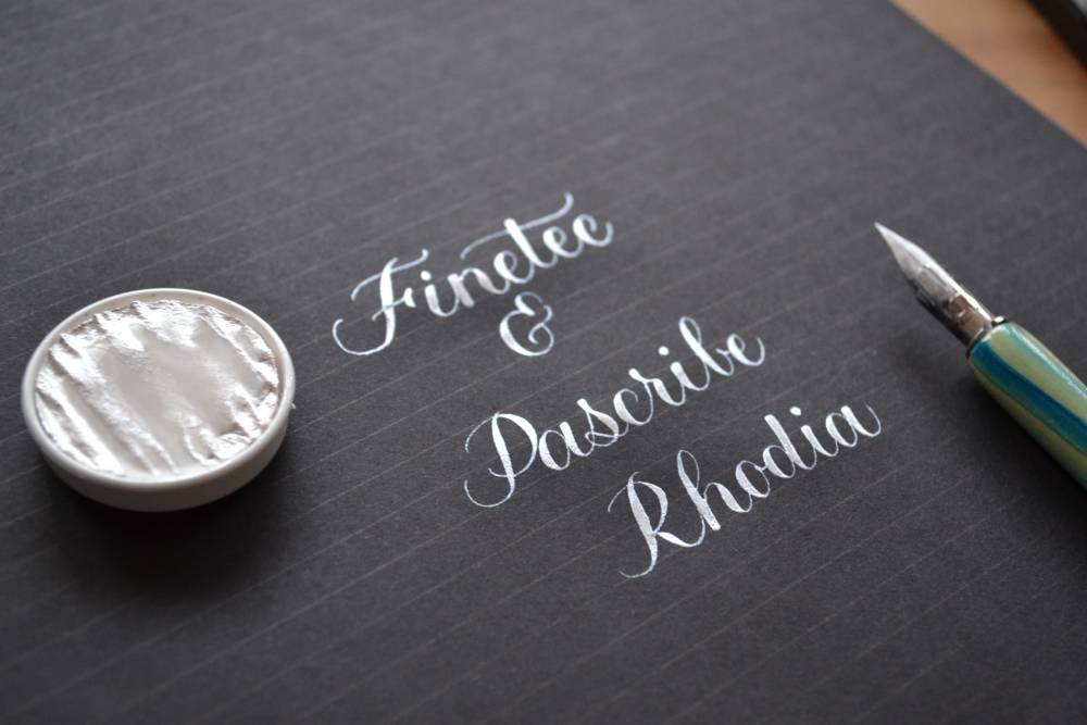
The PAscribe Rhodia pads have another feature that is different to the other Rhodia pads - the lines. I tend to prefer dots on my pads, since I find them less intrusive. They don’t distract me while I write, but rather guide me, so my lines aren’t all wonky. These pads only come with lines, however they were designed less obtrusive than on a normal lined pad. The grey pad has very thin grey lines, which are barely visible at times, depending on the lighting. The black pad however, is a whole different ballpark! When you look at the paper with no light source directly on it, you won't see the lines at all, but if you aim a light to the paper, the lines appear as if by magic!

I’ve tried Paul’s advice to have a light source on the right side, to show the lines while writing, and it definitely did the trick. It was a bit frustrating at first, since my light setup wasn’t the best, but once that was sorted, it all worked well!

Final thoughts
One of the good things about these new pads, is that they are not only great for practice, but they are perfect to write something special to post or give to someone. The paper feels so luxurious, due to the increased thickness and being able to write on both sides without transparency issues. This is definitely a plus for those of you, like me, who can’t stop writing once you start.
If you are thinking of purchasing these pads, I would definitely say ‘Go for it’! They really are amazing to write on with a variety of inks and pens, and you might not want to stop!
About the author
Vera Silva is the face behind The Preposterous Pigeon, a regular contributor to Simply Lettering magazine and has always loved to write and draw letters. The pointed pen is Vera's favourite medium but she really enjoys learning new ways of using her lettering knowledge and mixing it with different crafts. Vera runs online brush lettering workshops where you can learn the basics for yourself. Follow Vera on Instagram at @the_preposterous_pigeon and on Facebook here
Share this post
- 0 comment
- Tags: calligraphy, PAscribe, review